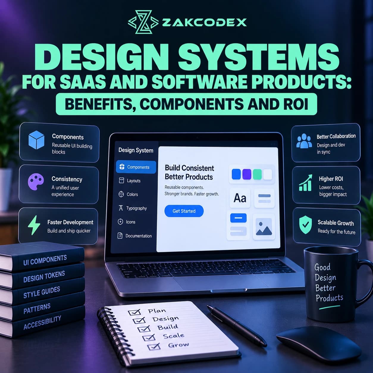
Design systems are shared collections of reusable foundations, components, patterns, standards and documentation that help product teams build consistent digital experiences at scale. A mature system connects design tokens, interaction behaviour, accessibility, production code, governance, adoption and measurement. Its value extends beyond matching colours to reducing duplicated work and making software easier to maintain.
Within product design, a design system provides reusable product infrastructure. It is broader than a Figma library or component catalogue, and requires continuing ownership. Faster delivery and better collaboration are potential outcomes; design system ROI must be measured against implementation, migration and maintenance costs.
How does a design system differ from a UI kit or component library?
A UI kit primarily supplies visual assets, while a component library supplies reusable interface elements. A design system adds the foundations, usage decisions and operating processes that keep those assets useful across products.
| Resource | Typical scope |
|---|---|
| Style guide | Brand, visual and editorial rules |
| UI kit | Design assets and interface variants |
| Component library | Reusable designed or coded controls |
| Design system | Foundations, implementation, patterns and governance |
Libraries can include excellent documentation and accessibility work. The distinction is broader responsibility: a product design system explains why a pattern exists, when to use it, who maintains it and how changes reach teams.
Why do growing software products need shared design infrastructure?
As features and teams multiply, repeated interface decisions can produce duplication and inconsistent behaviour. Shared conventions help teams focus on user problems instead of repeatedly rebuilding familiar controls.
| Area | Without a Mature Design System | With a Mature Design System |
|---|---|---|
| Design decisions | Repeated locally | Shared defaults with rationale |
| UI components | Similar implementations proliferate | Maintained reusable components |
| Development | Repeated styling and behaviour | Established implementation paths |
| Documentation | Scattered conventions | Discoverable usage guidance |
| Accessibility | Inconsistent component checks | Shared requirements and validation |
| Product consistency | Unnecessary variation | Predictable patterns |
| Designer-developer collaboration | Repeated interpretation | Shared names and references |
| QA | Many unique implementations | Reusable checks plus journey testing |
| Maintenance | Similar fixes repeated | Managed updates for adopters |
| Multi-product scaling | Separate conventions | Shared core, controlled variation |
| Onboarding | Knowledge gathered informally | Documented product conventions |
| Governance | Unclear decisions | Owners and contribution rules |
These benefits depend on adoption. An unused library cannot reduce duplication, and central updates only help products that install and validate them.
What should a design system include?
Start with recurring product needs: foundations, tokens, components, interaction patterns and documentation. Connect each layer to implementation and ownership rather than treating visual specifications as the finished system.
Foundations and design tokens
Define typography families, hierarchy, weights and line heights; colour roles; spacing scales; layout grids; containers; breakpoints; icon style and motion principles. Specify responsive behaviour and readability rather than fixing appearance for one screen size.
Design tokens represent reusable decisions such as colour, spacing, borders, radius and elevation. Primitive tokens store underlying values; semantic tokens express intent, such as a critical-message colour; component tokens apply decisions to particular controls. Semantic naming supports themes without scattering raw colour values through interfaces.
The Design Tokens Community Group develops an exchange format for sharing tokens between tools. Tool interoperability helps, but teams still need ownership and review when a shared value changes.
Components, states and patterns
Buttons, inputs, tables, cards, navigation and dialogs need behaviour, variants, content constraints and code alongside appearance. Document default, hover, focus, active, selected, disabled, loading, error and success states where relevant.
A component is a reusable interface element; a pattern combines elements to solve a recurring task. Search and filtering, onboarding, validation, notifications and empty states are patterns. Atomic design can help organise composition, but its terminology is optional.
For a SaaS table, specify sorting, selection, empty results, loading, errors and narrow-container behaviour. A screenshot of populated rows leaves most implementation decisions unresolved.
Accessibility and content guidance
Include keyboard behaviour, focus management, accessible names, contrast expectations and form instructions. Apply relevant WCAG requirements during component design and testing, then validate the complete product: accessible building blocks do not guarantee accessible composition.
Define terminology, button labels, error recovery and empty-state wording. Icon rules should cover meaning, size, stroke or fill and text alternatives where needed. Consistent language and predictable interactions are part of product consistency, not optional decoration.
How should design assets, code and documentation stay aligned?
Maintain explicit relationships between design components, production components and usage guidance. A single source of truth means authoritative, aligned decisions; it does not require every asset to live in one application.
A Figma design system can organise components, variants, variables and libraries. Production code provides the actual behaviour, whether implemented in React or another appropriate stack. Agree shared names and supported variants so designers do not specify controls developers cannot reuse.
Storybook is one option for developing, testing and documenting UI components in isolation, including difficult states. It is not mandatory. Documentation should explain purpose, appropriate and inappropriate use, examples, accessibility expectations and implementation constraints.
Developer handoff still needs feature-specific decisions: data flow, permissions and exceptional behaviour do not disappear. Reusing known spacing, typography and controls reduces repeated explanations while preserving discussion about the actual user journey.
What makes a SaaS design system different?
SaaS products often repeat complex operational interactions across dashboards, settings and administration. The system should standardise recurring behaviour while allowing legitimate domain differences.
Consider permissions, billing, onboarding, notifications, tables and complex forms. A read-only state differs from an unavailable feature, and an empty dashboard differs from a failed data request. Document those distinctions instead of creating endless cosmetic variants.
Across web applications, mobile apps, internal tools and customer portals, share foundations where appropriate while respecting platform behaviour. Multi-brand or white-label products can map semantic tokens to different themes while preserving component logic. Test each supported theme, especially contrast and state visibility.
Who should own governance and maintenance?
Design system governance defines who accepts changes, resolves conflicts, releases updates and supports adopters. Choose centralised, distributed or hybrid ownership according to team capacity and product diversity.
A central team can maintain standards while product teams contribute evidence and improvements. The GOV.UK Design System contribution criteria illustrate evaluating proposed components for usefulness, uniqueness, usability, consistency and versatility.
- Ownership: name design and engineering maintainers.
- Contributions: require a real need, examples and review.
- Quality: define documentation, accessibility and testing expectations.
- Releases: version changes, publish notes and explain compatibility.
- Deprecation: provide migration guidance and a supported transition.
- Maintenance: budget for bugs, platform changes and new requirements.
Design operations supports tooling, communication and contribution workflows. Avoid turning governance into a queue that forces teams to fork components. Missing functionality, difficult APIs, outdated examples and rigid rules are adoption problems requiring product research.
When is a full design system worth building?
Invest when recurring patterns, duplicated frontend work and coordination costs justify maintained infrastructure. An experimental prototype or temporary campaign may need only lightweight foundations and a small library.
| Stage | Practical investment |
|---|---|
| Startup | Tokens and frequently reused controls |
| Scale-up | Aligned design/code libraries and adoption support |
| Enterprise | Contribution governance, versioning and product variations |
Assess repeated work, inconsistency, accessibility governance and maintenance burden. Also confirm ownership and measurement capacity. A larger catalogue is not useful if nobody can support it.
A practical maturity path moves from recurring patterns to shared foundations, documented libraries, governed contributions and measured multi-product adoption. Teams may progress unevenly; maturity should describe capability rather than component count.
How can businesses measure design system ROI?
Design system ROI compares measurable benefits with the cost of building, adopting and maintaining the system. Combine financial evidence with productivity, adoption and quality measures rather than assuming reuse creates savings.
ROI = (Value of time saved + reduced rework + maintenance efficiency + other measurable benefits − design system cost) ÷ design system cost.
Use a consistent reporting period and monetary units. Include design, engineering, tooling, documentation, governance, migration and maintenance costs. Avoid counting the same saved effort as both faster development and reduced rework.
| Metric | What it can indicate |
|---|---|
| Component adoption rate | Use among eligible implementations |
| Duplicate components | Remaining redundant work |
| Common UI implementation time | Delivery effort for comparable tasks |
| Product coverage | Reach across eligible interface areas |
| System-related defects | Quality and release regressions |
| Shared accessibility issues | Unresolved barriers and recurrence |
| Contribution volume | Participation, interpreted alongside quality |
| Documentation usage | Discoverability and support demand |
| Upgrade adoption | Whether improvements reach products |
| Team satisfaction | Friction and confidence in reuse |
Baseline repeated feature types before rollout, then compare implementation, design review, component discovery and handoff effort after adoption. Account for differences in complexity and team experience. Time released is capacity, not automatically cash savings or revenue.
Track token usage, unnecessary variants and visual defects without penalising intentional differences. Pair documentation visits with feedback: heavy usage can signal usefulness or confusion.
What is a practical rollout strategy?
Pilot the smallest useful system in real product work before expanding it. Prioritise frequently used elements and remove adoption friction before adding speculative components.
- Audit interfaces and identify repeated patterns and defects.
- Define foundations and reusable design tokens.
- Prioritise buttons, inputs, navigation, feedback and common layouts.
- Specify states, responsive behaviour and accessibility expectations.
- Build aligned design and coded components.
- Document usage and establish review ownership.
- Pilot with product teams and measure adoption and effort.
- Expand from evidence, version changes and maintain continuously.
Do not standardise every feature or create variants for every request. Preserve user-centred design and purposeful product differences. The goal is enough reliable infrastructure to improve consistent delivery, with measurable benefits that justify its ongoing cost.